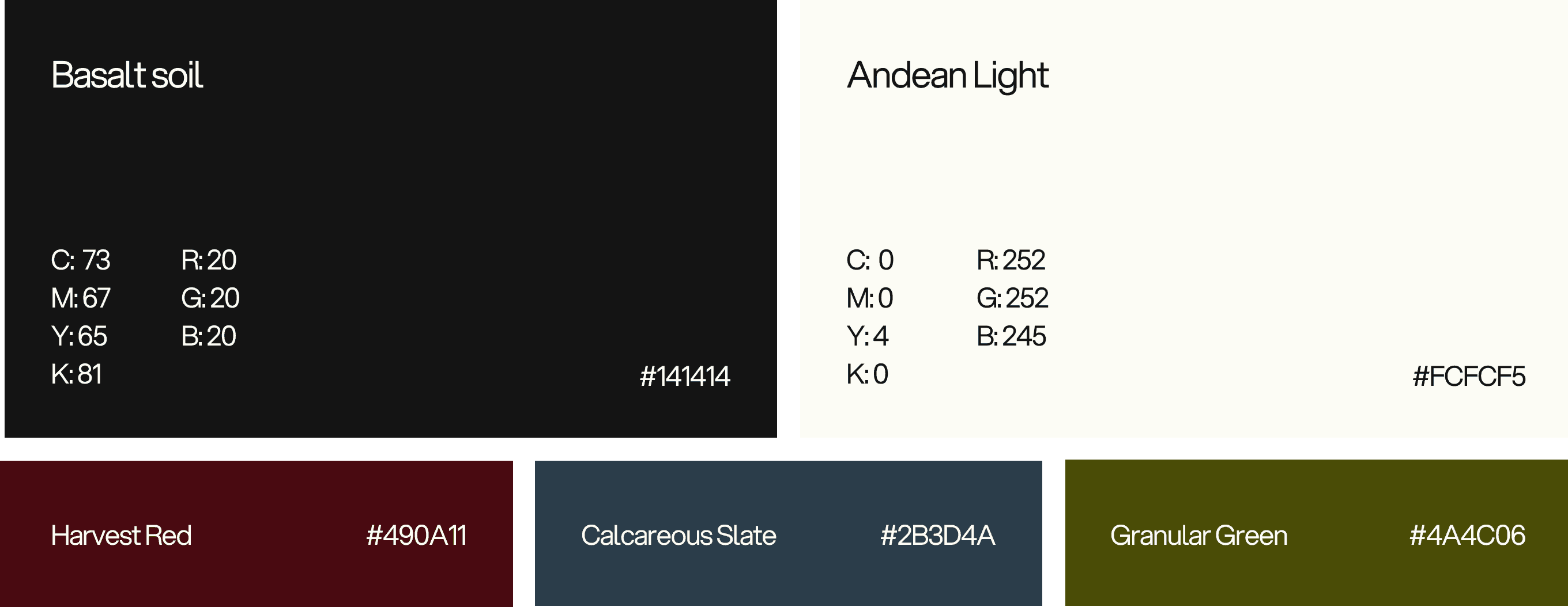
Brand Identity
Brand Identity
Packaging Design
Art Direction
Limited Release
Print Collateral
Brand Identity
Packaging Design
Art Direction
Limited Release
Print Collateral

Brand Identity
Packaging Design
Art Direction
Limited Release
Print Collateral
[ PROJECT ]
[ PROJECT ]
[ PROJECT ]
Challenge: Position Eterria in a saturated wine market without relying on category conventions. The identity needed to reflect what actually shapes the wine: altitude, climate, and time.
Challenge: translate complex
AI - infrastructure into a system that feels both technically rigorous and intuitively clear.
Solution: A restrained visual system built around environmental shifts - blurred imagery, precise typography, rooted in place.
Solution: develop a visual identity that treats intelligence
as architecture. Modular, layered, and dynamic.
[ COLOR PALETTE ]
[ COLOR PALETTE ]
[ LOGO ]
Color is used with restraint. Neutral tones establish the base - calm, structural. Deeper harvest and mineral hues introduce contrast that shifts with season and collection.


[ IDENTITY FRAMEWORK ]
[ IDENTITY FRAMEWORK ]
[ IDENTITY FRAMEWORK ]
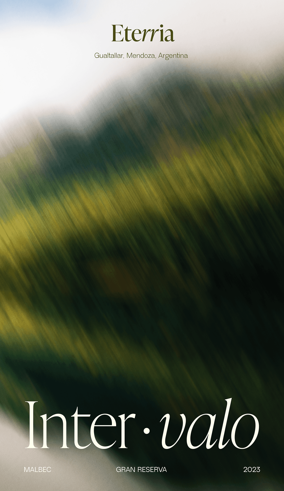
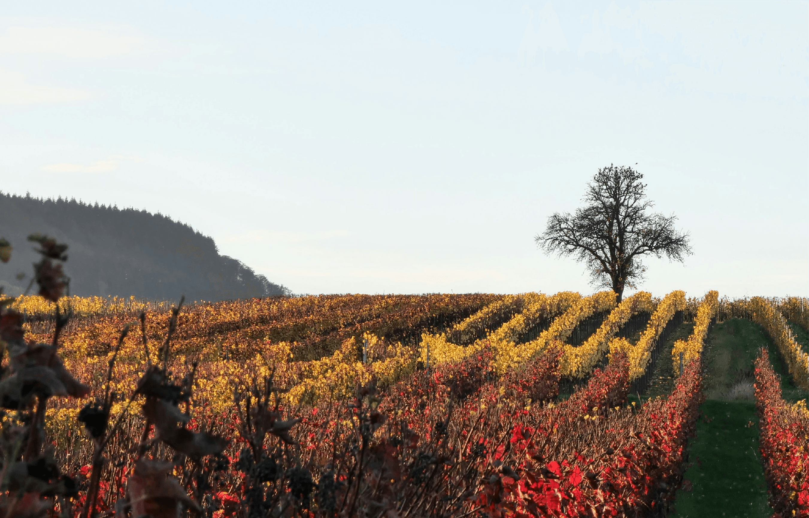
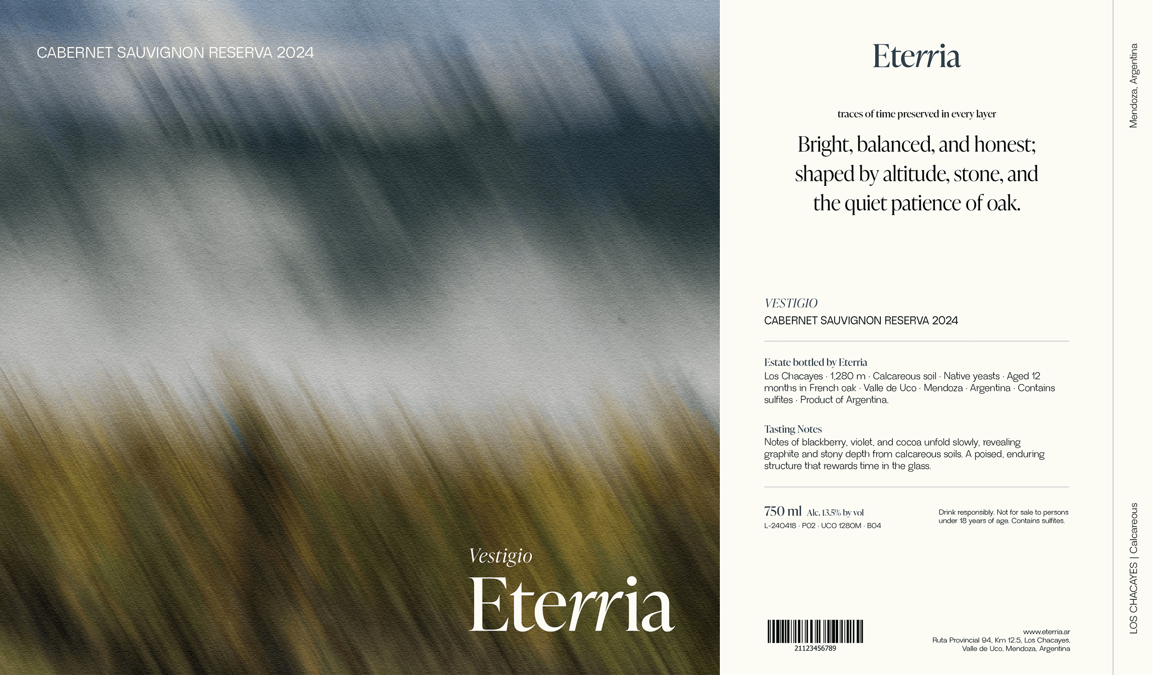
Land and time, a dialogue


[ CONCEPT ]
[ CONCEPT ]
[ CONCEPT ]
The identity builds on the idea of time shaping the vineyard. Blurred imagery reflects gradual shifts in light, temperature, and color that influence each harvest, while the typography and layout translate that calm precision into a restrained visual system.
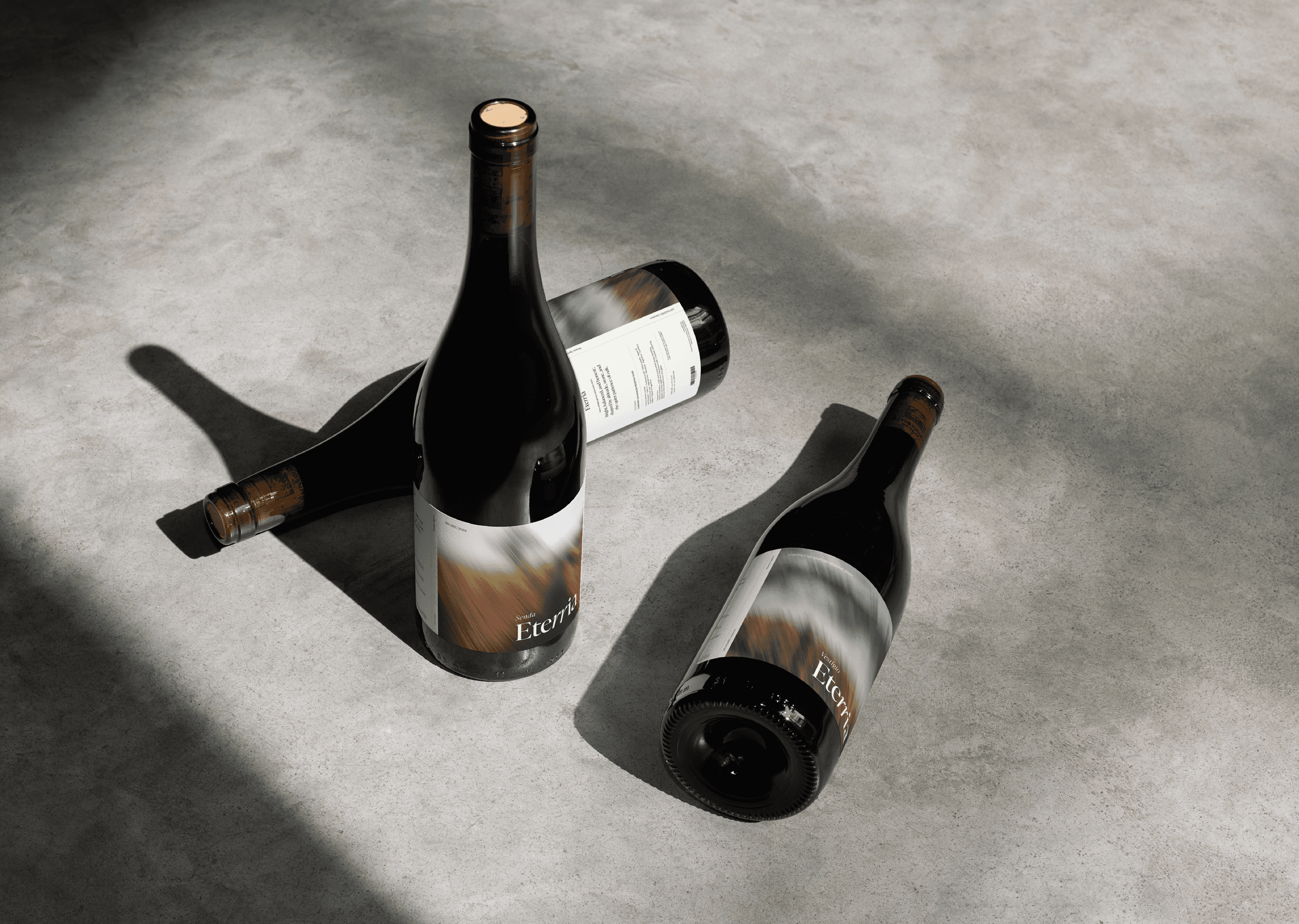
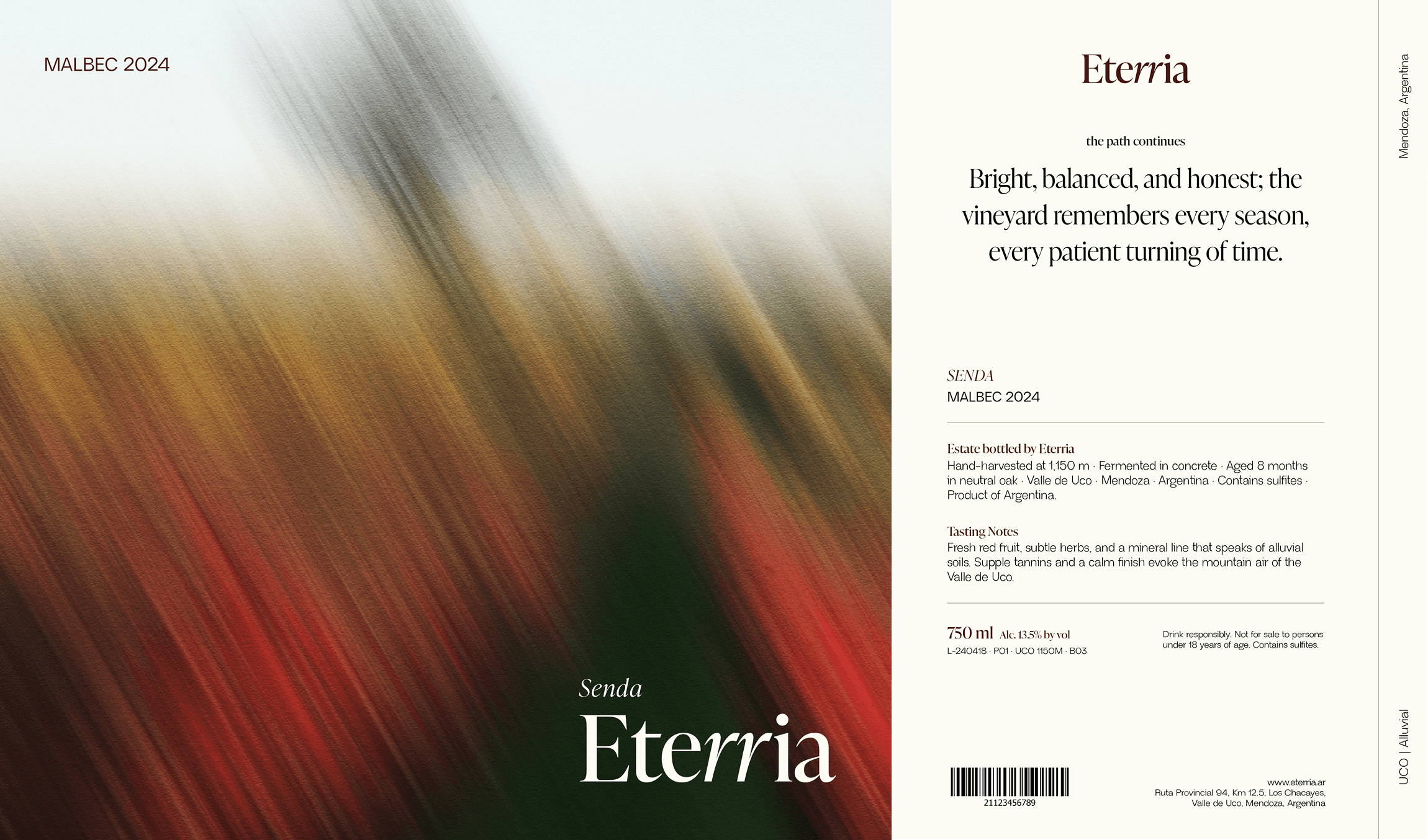
[ LABEL SYSTEM]
[ LABEL SYSTEM]
[ LABEL SYSTEM]
Each label is built around the same logic as the vineyard - nothing added that doesn't belong. The system scales across collections while maintaining a consistent sense of origin.
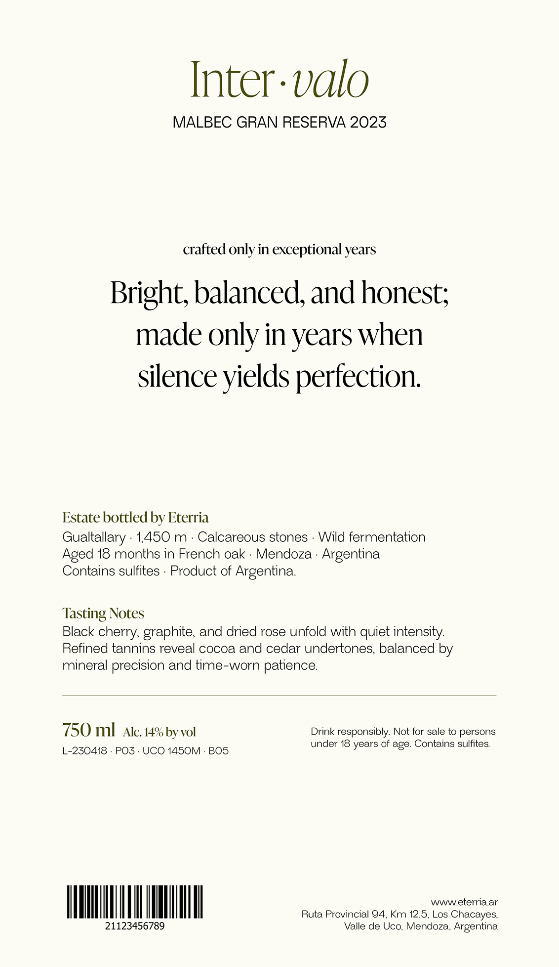


[ LABEL SYSTEM ]
Intervalo is a limited release - crafted only in the years when conditions align with absolute precision. The identity for this collection needed to signal rarity without announcing it.
[ LABEL SYSTEM ]
[ LABEL SYSTEM ]
[ INTERVALO ]
Intervalo is a limited release - crafted only in the years when conditions align with absolute precision. The identity for this collection needed to signal rarity without announcing it.


[ SEE MORE ]
[ SEE MORE ]
[ SEE MORE ]
Next Project : Syntra
The next layer of connected systems
AI Systems
Homepage
Modular Design
AI Infraestructure
Web Design
Concept
AI Systems
Homepage
Modular Design
AI Infraestructure
Web Design
Concept
AI Systems
Homepage
Modular Design
AI Infraestructure
Web Design
Concept


Next Project : Brew Spark
A thrid space for creatives.
[ SEE MORE ]
AI Systems
Homepage
Modular Design
AI Infraestructure
Web Design
Concept


AI Systems
Homepage
Modular Design
AI Infraestructure
Web Design
Concept