Brew Spark
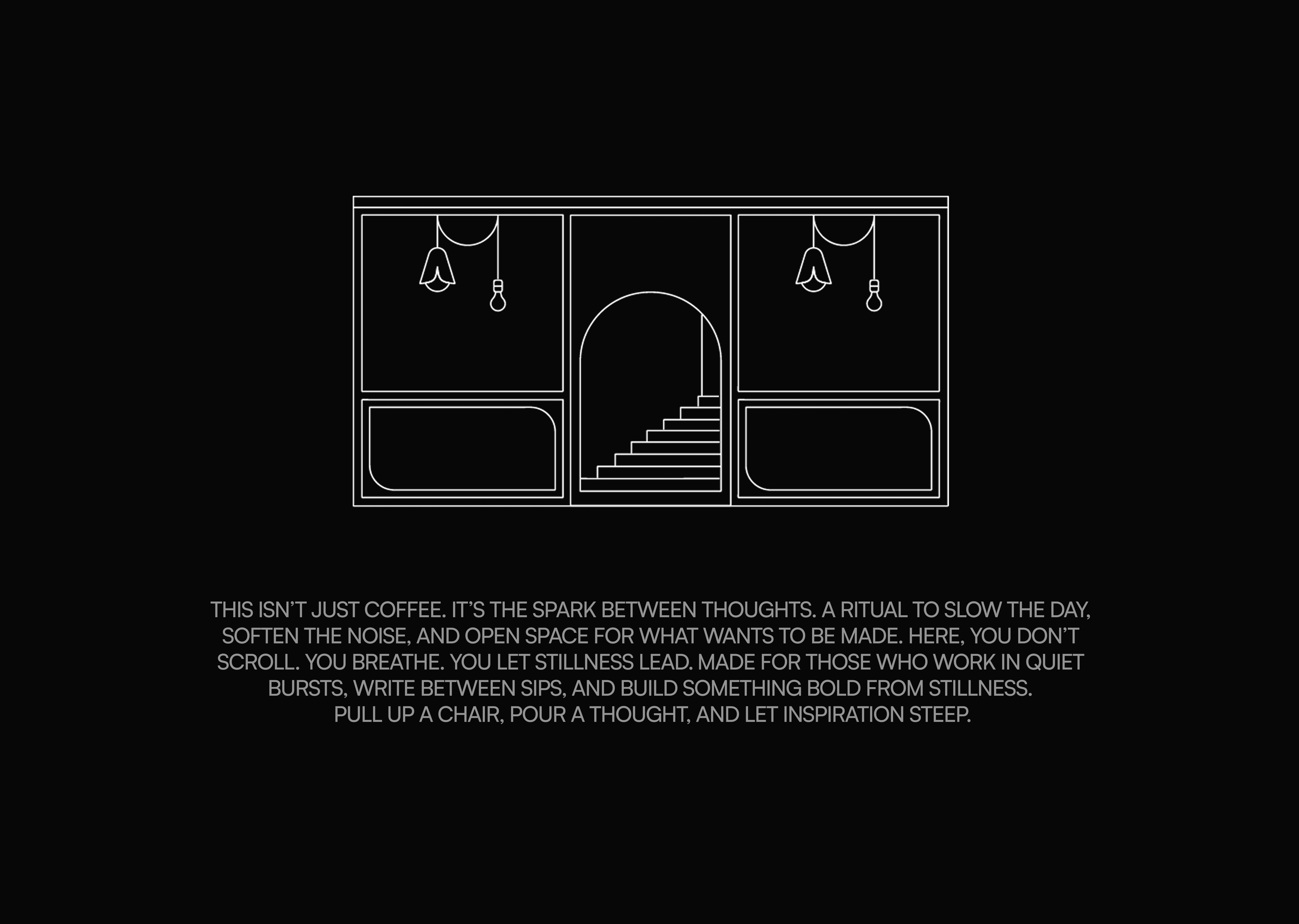
A third space for creatives.
Challenge
in dense urban environments, spaces tend to optimize for either productivity or socialization, rarely both.
Solution
define a third-space brand that bridges café culture and focused work through ritual, spatial cues, and modular visual language.
Brand Identity
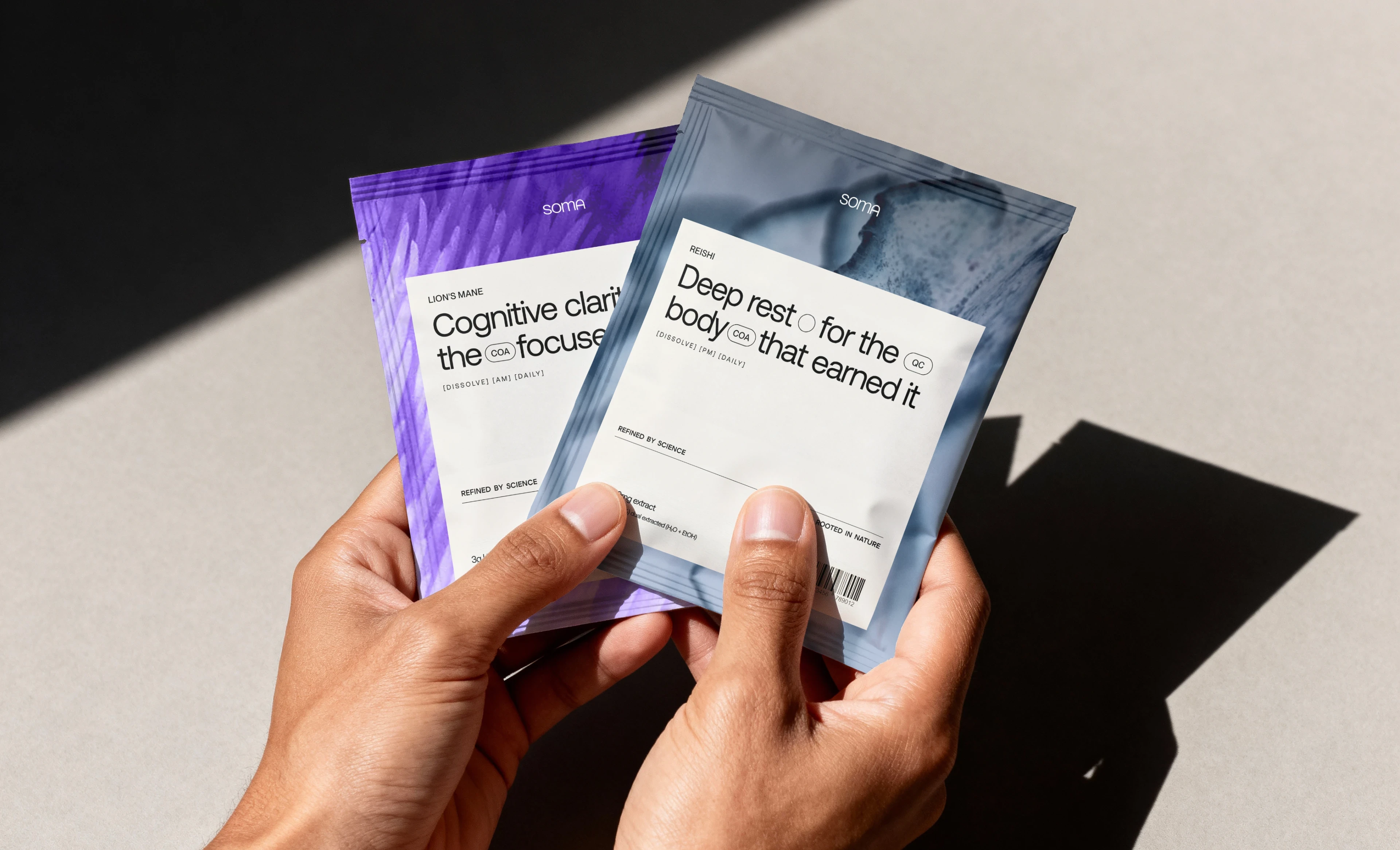
Packaging Design
Art Direction
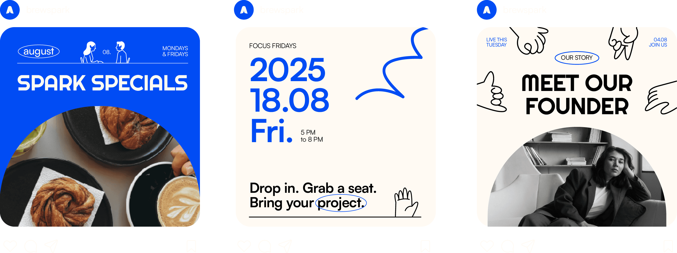
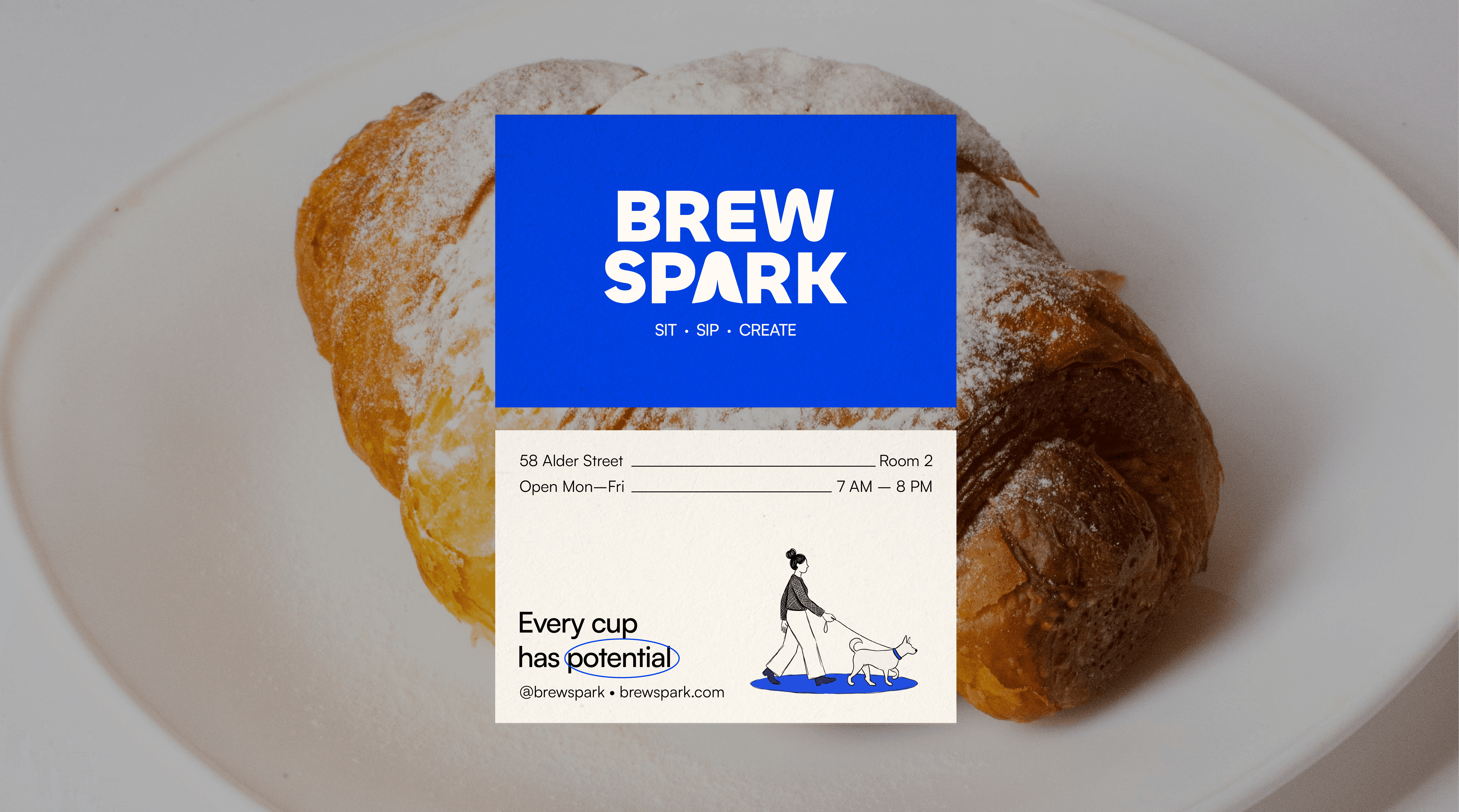
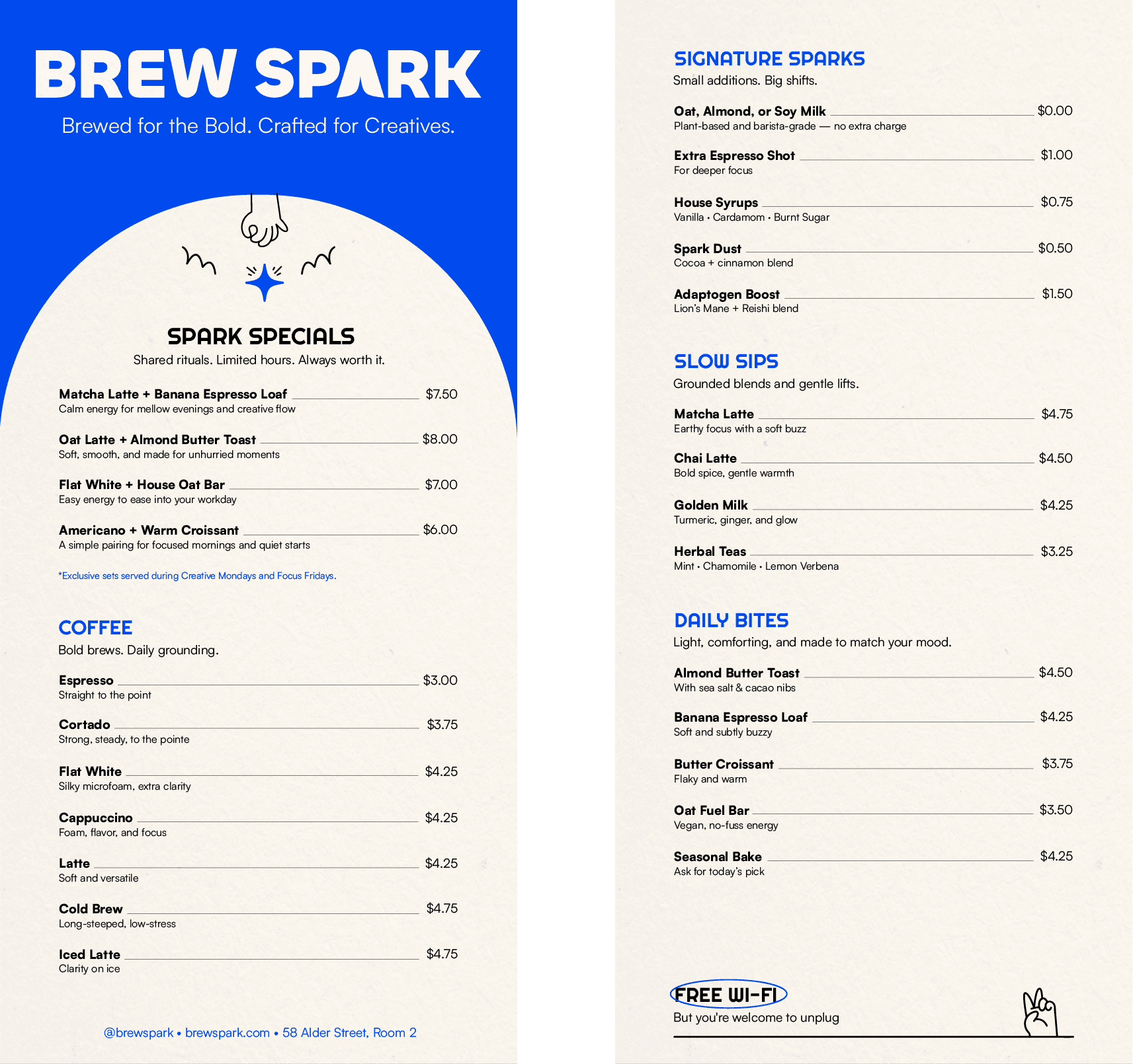
Print CollateralSocial Media
Illustrations
Color palette
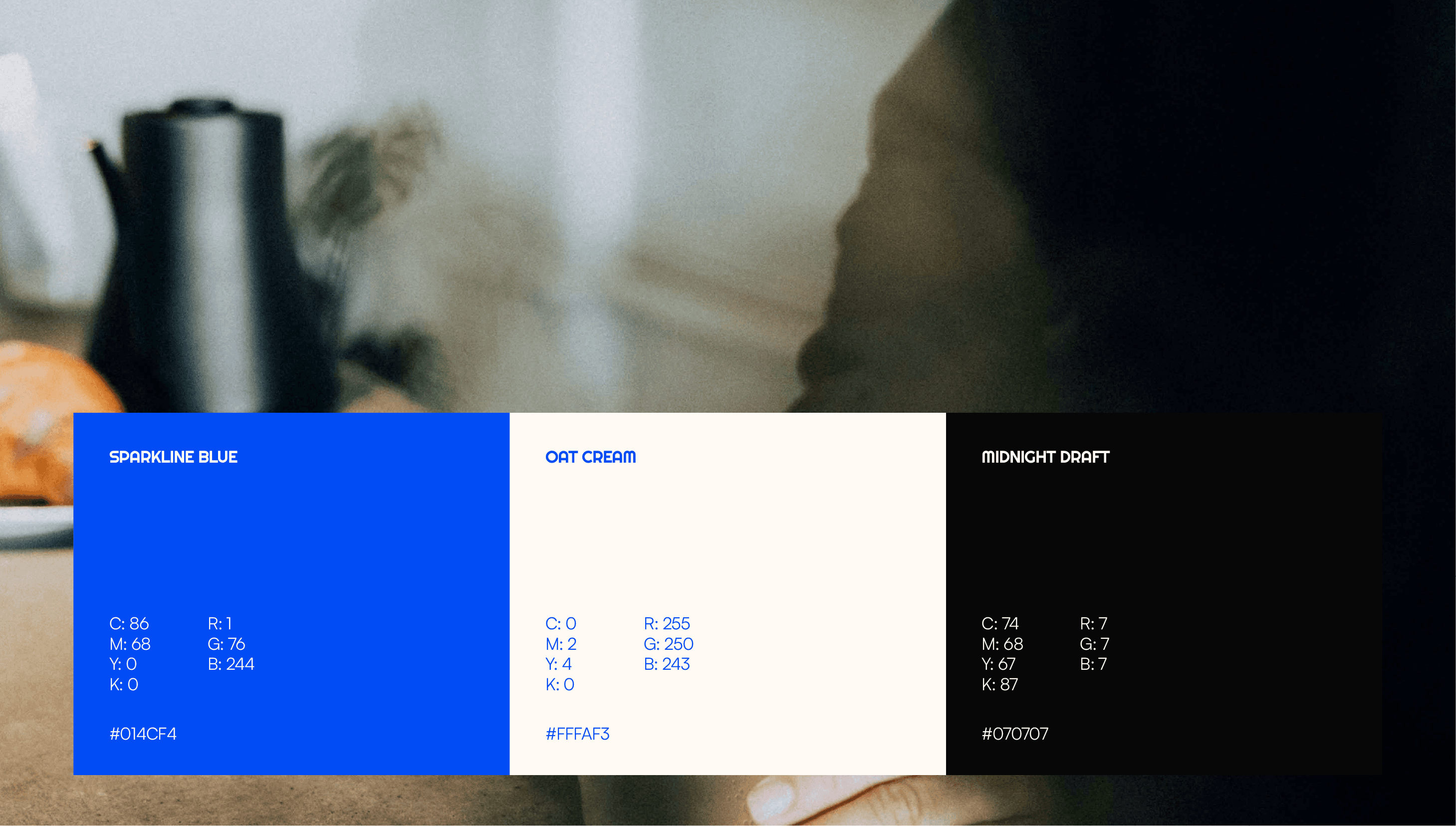
Color is used with intent. Oat Cream invites calm and clarity, while Sparkline Blue acts as a visual spark, marking zones of focus and creative flow.
Typography
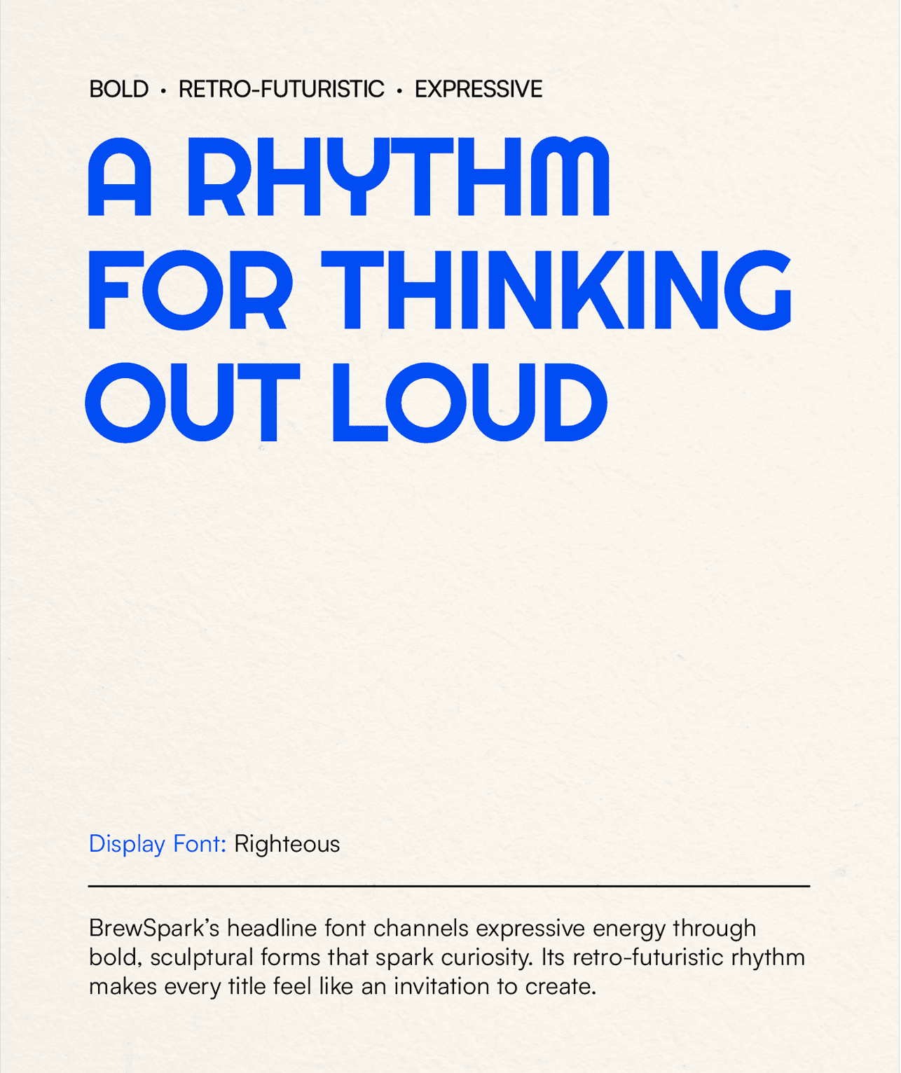
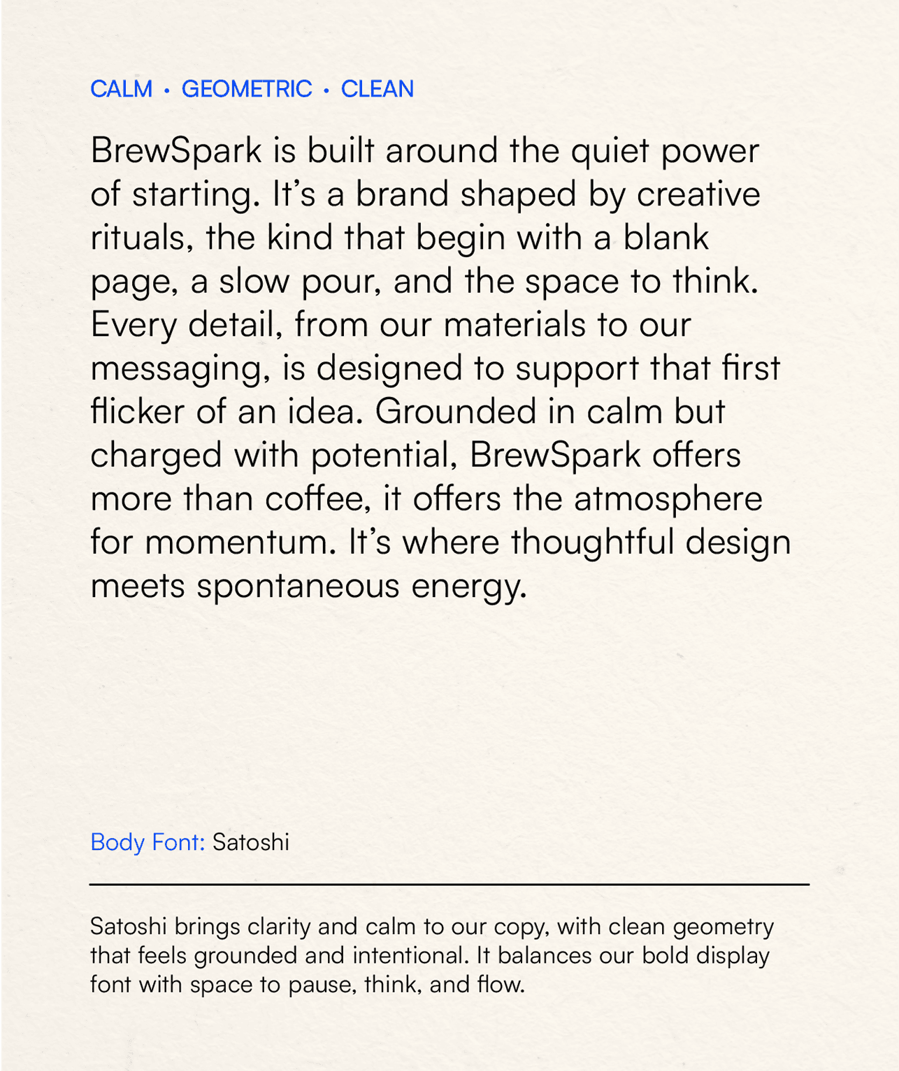
Our type system reflects the brand’s dual nature, a space for stillness and spark.

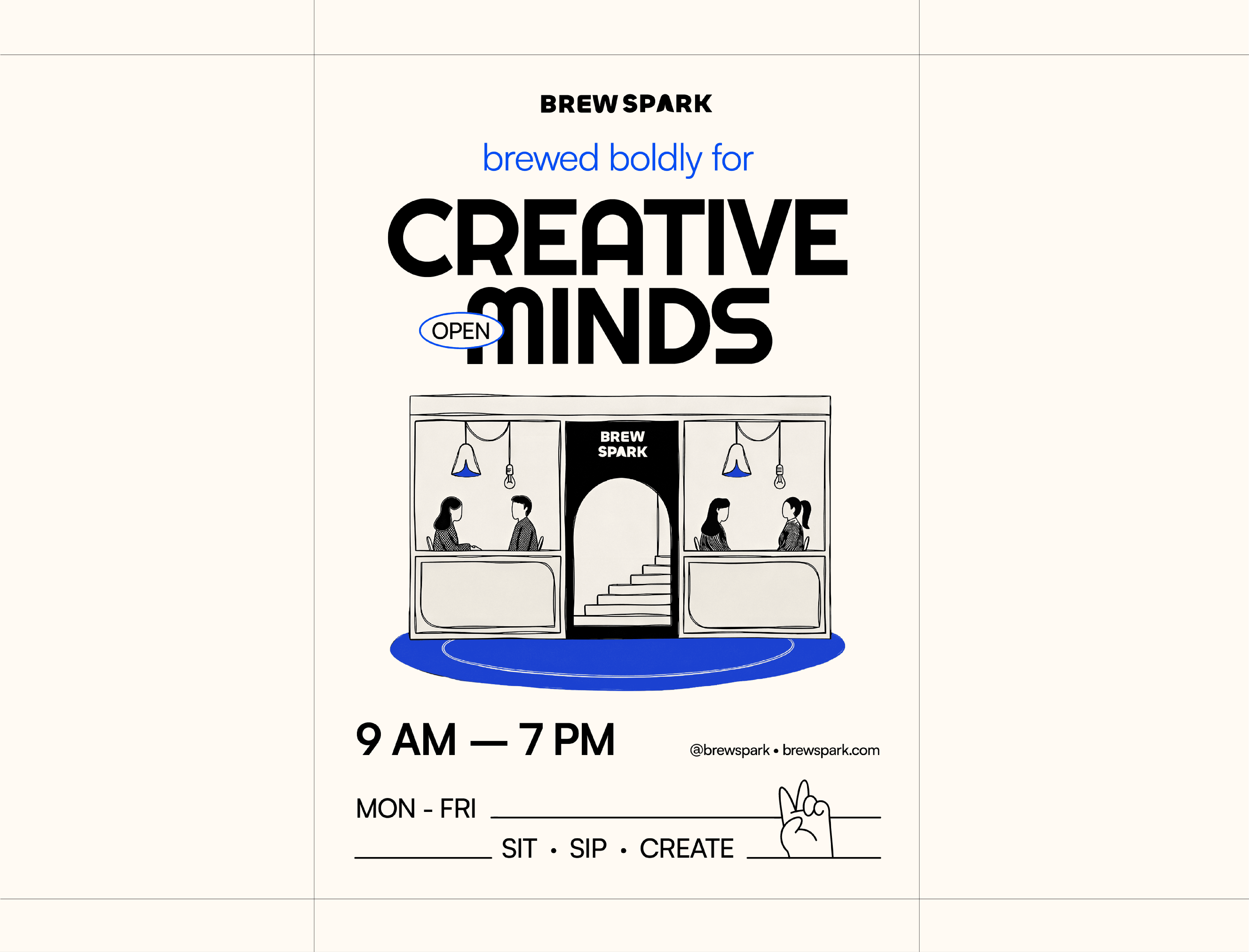
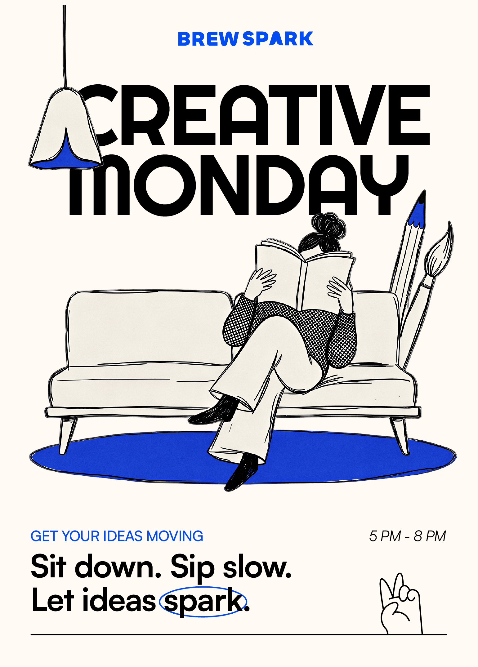
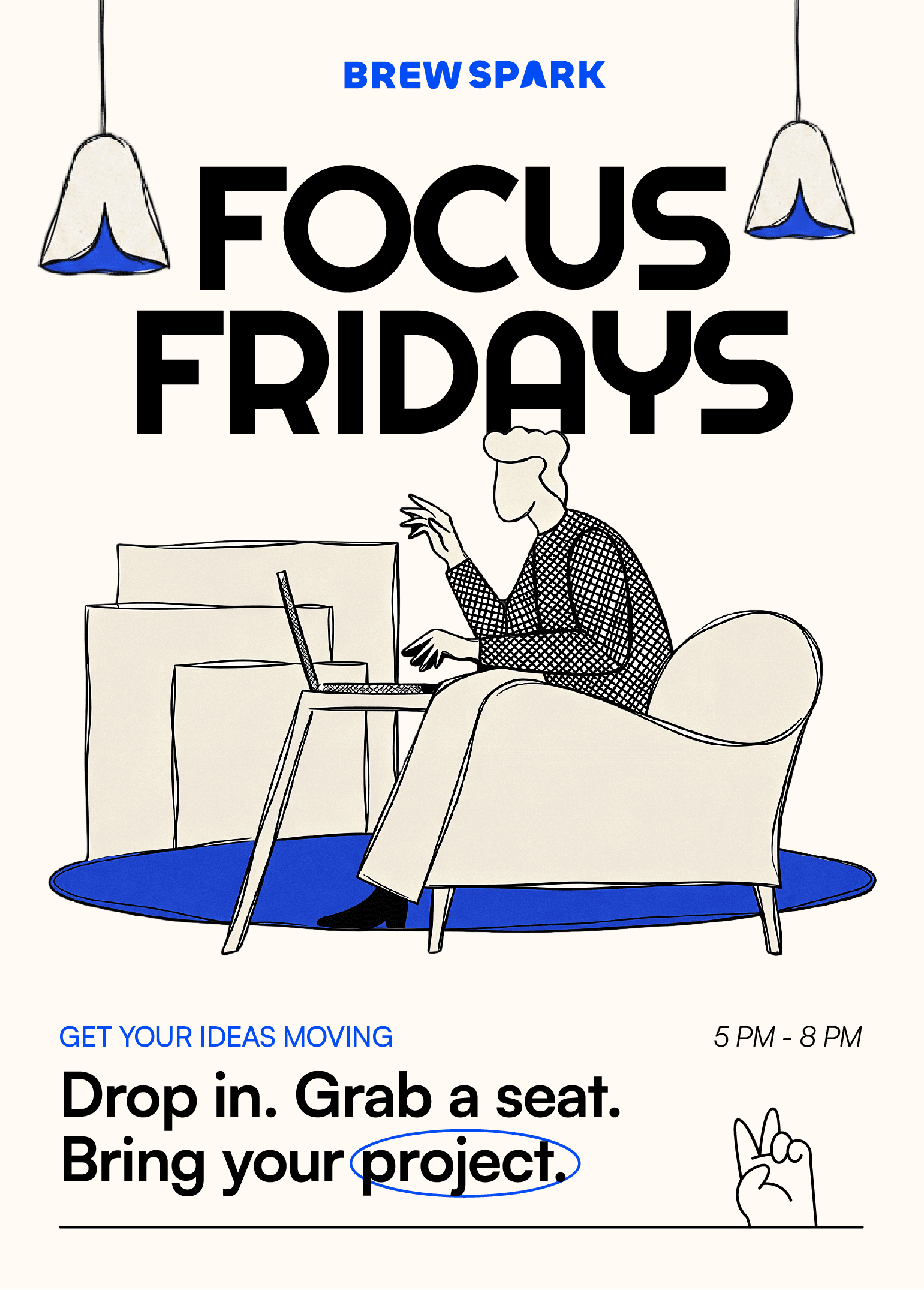
Marketing materials